Introduction
Building a website can be nerve-wracking. Beneath all the design decisions lies something even more crucial: your website’s layout. A well-thought-out layout ensures seamless navigation, readability, and engagement. Let’s explore some effective website layout ideas and examples to elevate your design game.

1. Freeform Grid
- What Is It? Most websites use some form of grid to maintain spacing and alignment. However, a freeform grid breaks away from rigid structures, allowing for creative placement of elements.
- Example: Imagine a portfolio website where project thumbnails overlap and flow organically.
2. Fixed Sidebar
- Why Is It Important? Navigation is a critical part of any website, and the sidebar is often the first thing users look for. A fixed sidebar ensures that essential links are always accessible.
- Use Case: Consider a blog with a sticky sidebar containing categories, recent posts, and social media links.
3. Text-Based Layout
- Simplicity Rules: Sometimes, less is more. A text-focused layout emphasizes content without distractions.
- Scenario: Think of a minimalist news website where headlines take center stage.
4. Magazine-Style Layout
- Inspired by Print: Borrowing from magazine layouts, this style combines images, text, and whitespace harmoniously.
- Application: Lifestyle blogs or content-heavy websites benefit from this approach.
5. Grid Breaking
- Breaking the Mold: Instead of uniform grids, intentionally disrupt the pattern. Overlay images, stagger content, and surprise users.
- Creative Use: An art gallery website could playfully break the grid to showcase diverse artworks.
6. Single-Column Layout
- Streamlined Simplicity: One column keeps things straightforward. Ideal for storytelling or personal blogs.
- Example: A travel journal with full-width images and immersive narratives.
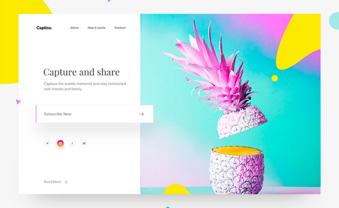
7. Hero Image Landing Page
- Visual Impact: A hero image (large, captivating visual) dominates the screen upon landing.
- Purpose: Perfect for product launches, event promotions, or brand introductions.
8. Whitespace as a Design Element
- Breathing Space: Whitespace isn’t empty—it’s intentional. Use it to separate sections and enhance readability.
- Implementation: Corporate websites often employ generous whitespace for a clean, professional look.
9. Responsive Design
- Mobile First: Design for mobile screens initially, then adapt for larger devices.
- Test Across Devices: Ensure your layout looks great on smartphones, tablets, and desktops.
Conclusion
Remember, your website’s layout is the backbone of user experience. Whether you’re a designer, developer, or business owner, choose a layout that aligns with your content, purpose, and audience. Craft visually appealing designs, guide users seamlessly, and leave them yearning for more. Happy designing! 🌐✨


