Best E-Commerce Websites in Auckland

What is E-Commerce?
E-commerce, often known as electronic commerce, is the exchange of goods and services as well as the sending of money and data through an electronic network, most commonly the internet. These business dealings can be either B2B (business-to-business), B2C (business-to-consumer), C2C (consumer-to-consumer), or C2B.
The widespread use of e-commerce sites like Amazon and eBay over the past 20 years has significantly boosted the growth of online retail. The U.S. Census Bureau estimates that 5% of all retail purchases in 2011 were made through e-commerce. When the COVID-19 pandemic broke out in 2020, it had increased to over 16% of retail sales.
How does e-commerce work?
The internet is what drives e-commerce. Customers use their own devices to access an online store to browse the selection and place orders for goods or services.
However, a successful online sales and marketing strategy has always relied heavily on attractive and distinctive website design. That’s because a great user experience and beautiful design can raise the perceived value of your products.
The following examples of e-commerce websites should provide you with plenty of website design inspiration, whether you’re planning to launch your first online store or are considering redesigning your present one.
What makes a great e-commerce website?
Tips for maximize conversions on e commerce websites

1) Learn Well About Customer’s Goals
Setting goals should be the first step before starting a site makeover or update. What aims does the company have for its website? What objectives do website visitors of the brand have? You are ahead of most e-commerce firms if you can respond to both of those queries.
2) Quick Navigation
A straight line connects two points the quickest. Too many websites require users to climb switchbacks in order to view and purchase a product. What if, though, your site’s layout eliminated the switchbacks and permitted a straight-line approach? The easy solution is that your conversions would rise along with your sales.
Your conversion rate will increase if customers can traverse your website easily from the landing page to the checkout page. Make shopping simple for your customers, and they’ll pay it forwards by buying from you.
3) Contact information
A lack of contact information on e-commerce websites is the biggest turnoff for potential customers. Include your email address, your phone number, and, if you can, your mailing address. These details, together with an About page, aid in giving potential buyers the impression that they are making a purchase from a real person.
4) The Perfect Product Page – Good visual appeal
For customers of your online business to visualise your products and click Buy, visual attractiveness is crucial.
When you are selling your things online, perception is crucial. People make their first judgement of your online store in only a few milliseconds. Making that impression count for your store depends heavily on the photos you use. A friend’s recommendation, a competent salesperson, and a thorough spec sheet are all examples of great content. A page with poor content has only marketing, no human voice, and more visitors leaving than checking out. Sales will increase if the information you offer on your product page is worthwhile.
Your store’s engagement, conversion, and retention are significantly influenced by your product images. In addition to product photographs, you should think about the fonts and colours used on your e-commerce website. The aesthetics of your shop influence how customers feel about the transaction in general. Even if you have amazing products, if your website’s aesthetics—specifically, the colours and fonts—don’t work, your clients may not buy from you.
5) Consider your website like a store
Your website serves as both a product showcase and a sales representative, saving customers from having to walk in and ask a staff for assistance. Thankfully, with the appropriate supporting content, it can successfully fill both functions.
The main business objectives we hear from owners of e-commerce websites are to boost conversions and sales. Customers’ top two objectives are product research and purchases. Your site will generate more sales if it makes it simple for clients to identify and purchase the ideal products for their needs.

One of the most effective instruments for arousing interest and feeling is colour. Additionally, it can be used to direct visitors to particular pages on your website and move them through the buyer’s journey.
Just use a primary colour and a secondary colour on your e-commerce website. You can utilise two excellent resources to decide on your colours. To find a colour scheme, start by going to Dribbble. You can browse examples of websites that use red in their colour scheme, for instance, by typing in “red,” and you can choose which possibilities are most aesthetically pleasing.
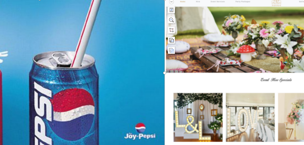
Here is an example of an online store that used a neutral shade of grey as its accent colour and a simple yellow warmer colour over white text.
The accessibility of your website is another important factor. People of all ages and abilities should be able to read and see your writing, so make sure the colours you choose for your website design have adequate contrast.
The final thing you should consider is the typeface. Customers anticipate engaging typography on websites rather than dated typefaces like Times New Roman. While the text on your e-commerce website conveys information, the typography conveys the emotion that underlies that information.
6) Mobile and web responsive design
Nearly 70% of the time spent with digital media is on mobile devices, according to Comscore. Unfortunately, a lot of e-commerce platforms are only designed with desktop browsing in mind and don’t optimise for mobile. Many potential new sales may be lost as a result of this.
Your store is responsive if you’re using Spiritx to establish your business. This indicates that users may easily navigate the website whether they are using a PC, smartphone, or tablet.
It’s advisable to personally test the usability of an e-commerce website design before making a decision based on mobile optimisation to ensure that you are satisfied with the international flow. If you’re not, there’s a good likelihood that neither will be your clients. When making your decision, consider factors like mobile navigation that is simple to use and cart drawers.
Best e-commerce website design examples
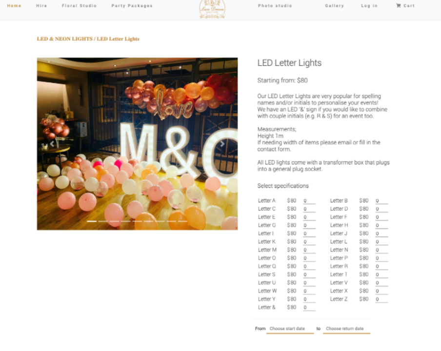
1) Luxedream Event Hire – Wedding
Luxedream Event Hire provide props, decoration and event furniture rental to events, weddings and parties. It also has a floral studio for events along with all-round event styling.
Luxedream Event Hire needed a website that was able to showcase their products and designs in a competitive market. The website needed to be fashionable and attractive to party goers. We partnered together and created a website where party goers and event managers could sign up and find everything they’ll want for their special occasion.

2) Website Design – SANY – Equipment
Vertu Equipment is a SANY authorized dealer that provides roading and construction equipment in New Zealand and the Pacific Islands. It’s equipment are in many sectors such as construction, infrastructure, agriculture and forestry.
The Vertu Equipment website was designed to showcase its product range along with all parts and services it offers. It’s website design reflects its relationship with SANY and convey its own identity in the New Zealand market.

3) Dacxi – Crypto currency
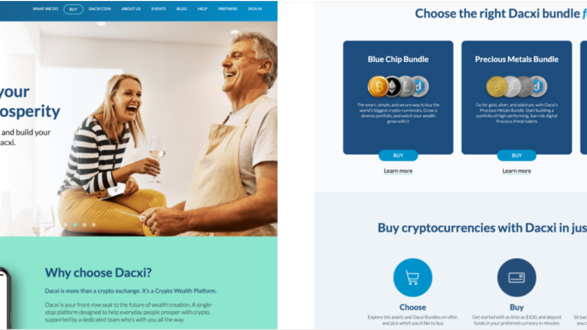
Dacxi is a crypto currency based wealth platform with its own crypto exchange, learning platform and exchange coin. It’s mission of generating crypto wealth for everyday people has given many people financial freedom across the world.
The Dacxi website is developed following its brand identity and showcased its crypto based bundles and learning modules. The website needed to convey trust and confidence in a financial institution which needed to feature the highest security ranking. A full bespoke CMS is also built in to allow frequent updates along with a smooth user flow.
4) Software – Jadcup – Manufacturer
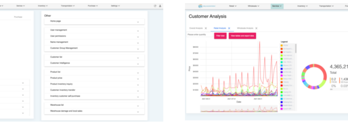
Jadcup is New Zealand’s largest manufacturer of paper cups, it supplies hundreds of cafes and restaurants with its recyclable cups which is used by many consumers in NZ.
After years of using legacy software, Jadcup felt the need for a complete upgrade. We had the opportunity work with Jadcup on a bespoke management system that’s able to streamline the entire business. The system needed to record inventory, track factory production and handle client orders at the same time. It was a allrounder that will supports every operation in the business.

5) Software – Flyway Express – Logistics
Flyway Express is the largest diary specialized supply chain and exporting logistics business in New Zealand. It supplies Asian markets with NZ diary products and is a NZ Ministry of Primary Industries’ registered diary processor.
Flyway Express was looking for a system that was able to streamline its ordering operations. At the time, Flyway was using up to 5 different software to manage orders which were causing major inefficiencies. After lengthy business research and understanding the operations, we been able to provide a bespoke solution that handles all their orders and inventory in one large enterprise system.
Build your e-commerce website with Spiritx today
Design is one of the most crucial factors that business owners and marketers need to take into account when constructing a successful e-commerce firm. After all, a visitor to your online store can create an opinion about it in a matter of milliseconds. First impressions are important, just like book covers.


