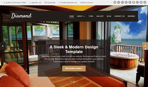
In the competitive hospitality industry, a well-designed hotel website is more than just a digital brochure—it’s a gateway to guest experiences. Whether you manage a luxury resort, a boutique hotel, or a cozy bed and breakfast, your website plays a crucial role in attracting and converting potential guests. Let’s explore the art of hotel website design, understand its impact, and discover how to create a memorable online presence.

1. The Essence of Hotel Website Design
Your hotel website is a virtual lobby—a place where guests form their first impressions. Here’s why investing in thoughtful design matters:
- Visual Storytelling: Stunning visuals evoke emotions and transport visitors to your property.
- User Experience (UX): Intuitive navigation, clear information, and seamless booking processes enhance the user journey.
- Brand Identity: Your website reflects your hotel’s personality, values, and unique selling points.
2. Key Elements of Effective Hotel Website Design
a. Striking Imagery
- Hero Images: Use high-quality, captivating images that showcase your property’s best features.
- 360-Degree Tours: Virtual tours allow guests to explore rooms, amenities, and views.
b. Clear Information
- Room Details: Provide comprehensive information about room types, amenities, and rates.
- Location: Highlight nearby attractions, restaurants, and transportation options.
- Contact Details: Make it easy for guests to reach out for inquiries or reservations.
c. Seamless Booking Process
- Booking Widget: An integrated booking engine ensures a smooth reservation process.
- Promotions and Packages: Showcase special offers and seasonal deals.
d. Mobile Responsiveness
- Mobile-First Design: Most travelers browse on mobile devices. Ensure your site looks great on all screens.
3. Inspiring Hotel Website Designs
Let’s draw inspiration from some well-executed hotel websites:
- One&Only Cape Town:
- Why It Works: Simple elegance, floating “book now” widget, and stunning visuals.
- Takeaway: Less clutter, more impact.
- Hotel Particulier:
- Why It Works: Scrolling text, animations, and a sense of discovery.
- Takeaway: Create an immersive experience.
- Casa Angelina:
- Why It Works: Magazine-style visuals, scrolling menu, and a prominent call to action.
- Takeaway: Basic design can be elevated with elegance.
4. Conclusion
Your hotel website is more than pixels—it’s a bridge between your property and potential guests. Invest in design, usability, and authenticity. Remember, a well-designed website isn’t just about aesthetics; it’s about creating an emotional connection that inspires bookings.
Feel free to adapt these principles to your specific hotel brand. Whether you’re a boutique inn or a sprawling resort, let your website be an invitation to unforgettable experiences. If you need further guidance or have specific requests, feel free to ask! 😊


